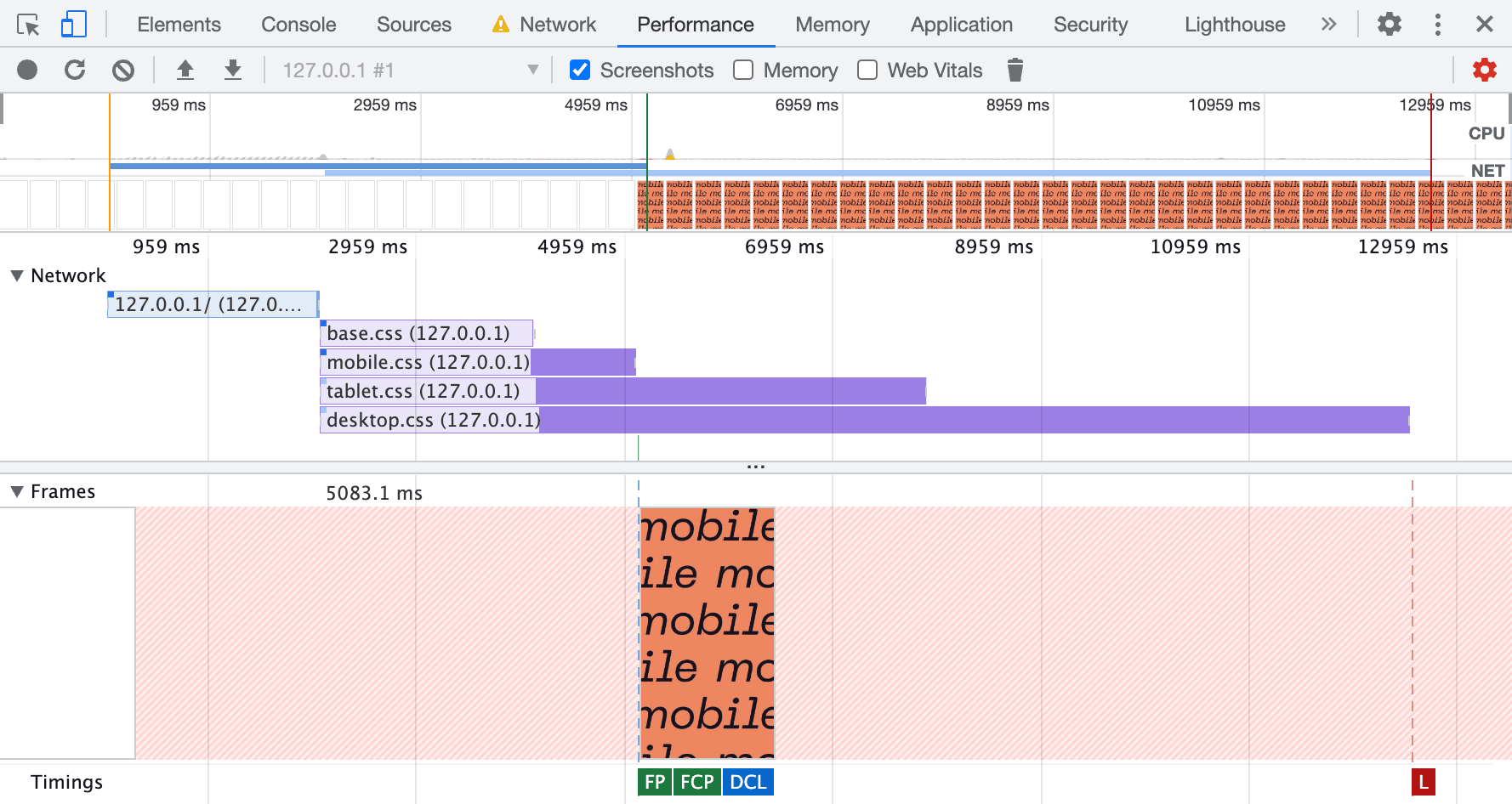
When CSS is bundled into one file, even after tree-shaking, it still contains a lot of unused CSS because of different @media contexts (mobile, tablet, desktop, dark/light/other themes, etc.).
It’s bad for Core Web Vitals: First Input Delay (FID), Largest Contentful Paint (LCP), Cumulative Layout Shift (CLS), as well as other vital performance and usability metrics: First Contentful Paint (FCP), Total Blocking Time (TBT), Time to Interactive (TTI), and DOMContentLoaded event.
There is a way to improve CSS loading and rendering significantly by separating CSS into different files, where every file contains only code needed in that context.
Separate your CSS into different files:
📄main.css        - contains CSS needed for all @media conditions
📄screen.css      - contains CSS needed only for screen @media condition
📄print.css       - contains CSS needed only for print @media condition
📂breakpoints
    📄x-small.css - contains CSS needed only for X-Small breakpoint
    📄sm.css      - contains CSS needed only for Small breakpoint
    📄md.css      - contains CSS needed only for Medium breakpoint
    📄lg.css      - contains CSS needed only for Large breakpoint
    📄xl.css      - contains CSS needed only for Extra large breakpoint
    📄xxl.css     - contains CSS needed only for Extra extra large breakpoint
📂themes
    📄light.css   - contains CSS needed only for light theme
    📄dark.css    - contains CSS needed only for dark theme
Then, include CSS files like this:
<link rel="stylesheet" href="main.css" media="all">
<link rel="stylesheet" href="screen.css" media="screen">
<link rel="stylesheet" href="print.css" media="print">
<link rel="stylesheet" href="x-small.css" media="(max-width: 575px)">
<link rel="stylesheet" href="sm.css" media="(min-width: 576px)">
<link rel="stylesheet" href="md.css" media="(min-width: 768px)">
<link rel="stylesheet" href="lg.css" media="(min-width: 992px)">
<link rel="stylesheet" href="xl.css" media="(min-width: 1200px)">
<link rel="stylesheet" href="xxl.css" media="(min-width: 1400px)">
<link rel="stylesheet" href="light.css" media="(prefers-color-scheme: light)">
<link rel="stylesheet" href="dark.css" media="(prefers-color-scheme: dark)">
With this approach, modern browsers prioritize CSS loading for the current @media conditions, so page rendering starts much faster because users don’t need to wait for the loading of the unused part of the CSS.
In cases where you have all the CSS bundled in one file and don’t specify conditions in media attributes of link tags, the browser waits for the entire set of CSS to load before starting page rendering. Which slows down page rendering drastically.
Breakpoints in this example are based on Bootstrap 5. This approach will become even more important for Bootstrap soon given that they will add support of light/dark/other themes.
If you want to make the web better and faster, please:
- share this article,
- send this article to the developers of the frameworks you use,
- implement this CSS separation on your sites.
Share on social media or save for later:
If you want to read more on this optimization and the browser’s behavior, please see the following:
- The article “Conditionally adaptive CSS. Browser behavior that might improve your performance” by Vadim Makeev. The cover screenshot for this article is taken from his excellent article, where he has more screenshots and experiments.
- MDN Web Docs: CSS performance optimization.